Engage —
Agent Selection
TLDR: Customers could benefit from a more powerful way to find the best agent for them. I worked with product managers and researches to plan and design a roadmap of features to improve this experience. Through this project I led Design Sprint activities, created multiple prototypes, hi-fidelity designs, and a short/medium/long staggered plan for implementation.
Crafting the right connection
The heart of Engage is the ongoing relationship between customer and their agent at their financial institution. Connecting with the right agent greatly influences what a customer is able to get out of the app. Many of these relationships are extensions from the branch, but we also connect and create new relationships.
The previous solution dropped customers right into a choice without enough context and didn't give them flexible ways to find what was best for them in an simple, informed way.
Overview
- Problem — Users were dropping off during onboarding when they hit agent selection. Our customer financial institutions also had different operating models that contributed to wanting to surface agents in different ways.
- The users — Main focus was new customers who were going through agent selection for the first time. It also needed to work for choosing a new agent.
Goals
Reduce onboarding dropoff Customers were dropping off when they hit agent selection. Maybe more context would help?
Connect customers with the right agent — Allow customers to find an agent that better suits their needs or desired type of relationship.
Questioning our premise: Does the “right choice” exist? Does it matter? Some people care, but there are those that don’t.
Understanding
To get a better idea of why someone might choose an agent we interviewed a subset of customers on the pilot app.
Pilot interview question: What was the single most important factor when choosing an agent?
Primary reasons:
- Recommendation from other people
- Experience - (including previous experience with that agent)
- Existing relationship with agent
- Similar interests
In addition to this, we also found that there were some who weren't concerned about their relationship with their agent. These customers tended to be more transaction focused, where that relationship isn't as beneficial, or newer customer who haven't yet developed relationships and context yet.
Not everyone needs or cares about the depth of an ongoing 1:1 relationship, but they could still get value from the product. Let’s not forget them.
After gathering this data I decided to plan some Design Sprint sessions to find the commonalities between customer needs and needs of our customer financial institutions. They had different desires and needs based on their different business models so our solution needed to be flexible.
Design Sprint activities
I’ve found certain Design Sprint activities extremely useful, but often time or the scope of the problem lead to a more selective collection in place of the full week. The most effective use of these activities depends on what you’re trying to solve.
These sessions tend to have the most forward momentum when we leave with something visualized — regardless of the level of fidelity. Because of this I focused mainly on a How Might We session and Crazy 8s.
One of the main problems to consider was the differing needs/wants of our customer banks in relation to what user research told us end customers needed. I started by grouping the needs of financial institutions and customers to find commonalities.
After that we began a How Might We session to get ideas on the board and get everyone thinking on the same page. We found that the most useful areas of refinement were:
- Location — find an agent nearby or in a specific location
- Expertise — get help in a specific financial area
- Agent name — find someone you know or a recommendation
Once we had completed the HMWs and Crazy 8's I got the team to get into groups and flesh out our favorite concepts. Leaving a session like this with something tangible that everyone feels like they can work towards has often been incredibly beneficial for the forward momentum of the project.
Prototypes
After reviewing our concepts I decided to test two very different versions of an onboarding/agent selection process. We were interested in both approaches, but wanted to compare usability and get a better sense of how they might feel when visualized.
Conversational Prototype
The first was the conversational tapback approach in the vein of Penny among others. The appeal of this approach was that if the whole app is about conversation then why not get people into a conversational interface as soon as possible.
I started this design prototype by planning out all the different paths and flows a person could go through based on a series of responses.
I then created a clickable prototype to test the usefulness of this interface and interaction model. The user is greeted by an automated agent and given instructions through messages. All interactions happen through tapback responses, simple inputs, and agent cards returned directly in the faux conversation.

While most people who tested the conversational onboarding found it interesting or novel, not many found it more useful for actually accomplishing the goal.
Many people wanted to go back to a specific step or more quickly navigate to another area of expertise or location. Trying to create paths for all of these options made it feel like we were pushing against the grain — maybe another pattern was needed.
Exploratory Prototype
I was also designing the second prototype in parallel. This prototype was focused on a more exploratory model of interaction — giving the user a way to explore multiple different refinements such as locations or expertise in succession or together.
The initial flow was comprised of a few main parts:
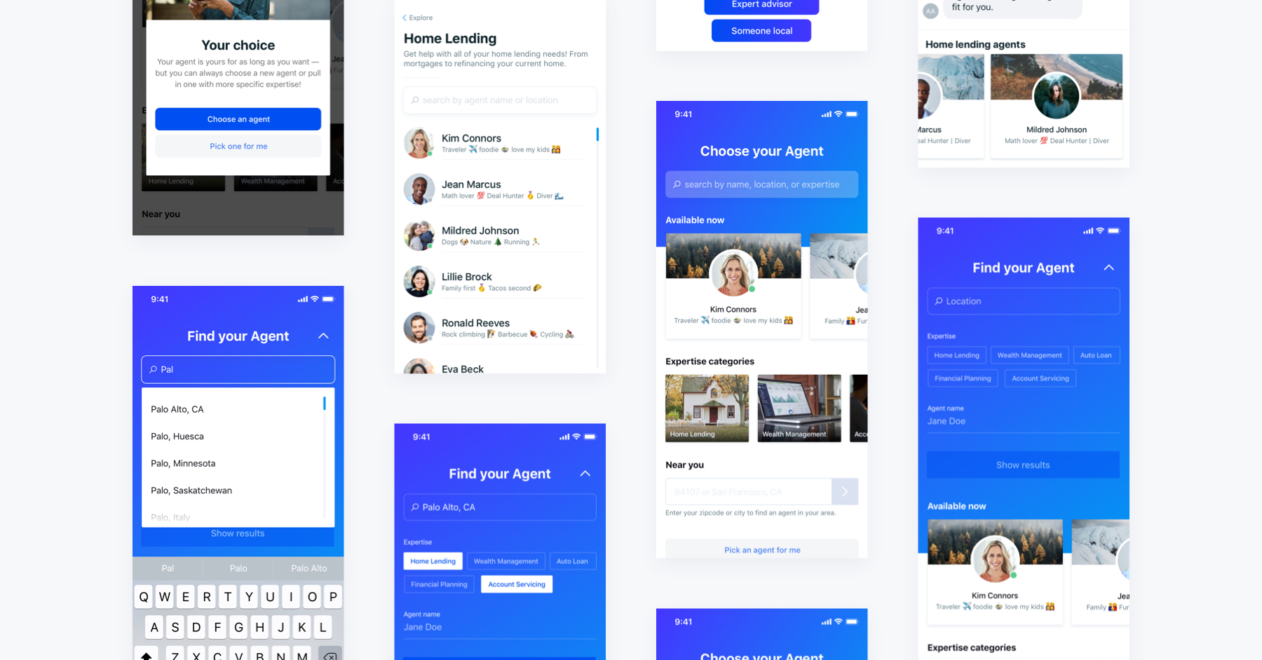
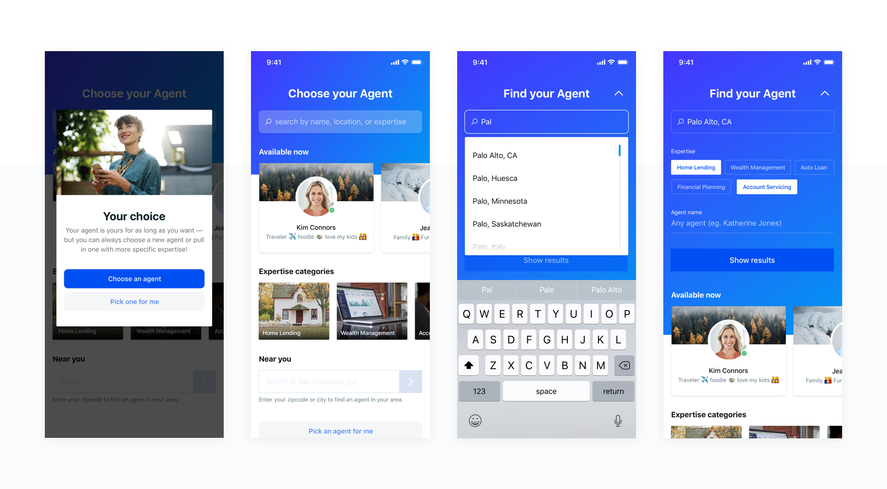
Educational modal — explaining what agent selection means
- This choice isn’t forever — your agent is with you as long as you want
- Added context that we wrongly assumed was there for first time users
Agent selection home screen
- A powerful search section for names, locations, and expertise
A list of currently available agents
- For the people who just need help and are less concerned with where it comes from
- A list of cards that link to expertise pages
- A Near You section for finding an local agent
- Expertise pages — explaining the type of expertise and returning a searchable list of agents with that tag

This prototype allowed for much more flexible use cases and seemed to fit with how someone might expect to accomplish this task. People that we tested with were more likely to explore multiple areas of expertise, locations, or search options than in the conversational prototype.
Solution design
In the hi-fi designs I used primary theme colors to both draw attention to the header area and allow customers financial institutions space to express their branding. I introduced the expanding header to allow customers to still scroll and reference information on the page while searching and to set foundation for a future search experience.
As I tested these designs I found that people were diving into multiple pieces of expertise or locations. We considered things like geolocation to more quickly show local agents, but it didn't make sense for two reasons: we never use location again (and didn't want to ask for data we didn't need) and there are situations in which your location may not be where you want your agent to be. We decided to instead give control to the user.

When bringing these designs to a higher fidelity I also made more considerations around copywriting. I tried to make the empty states of the input fields better represent the idea that they aren't all necessary to show results while also keeping the placeholder hints around what type of information should be entered.
I also introduced subtle animations in places like the search button to convey that not all information had to be entered to search by drawing more attention to it after the first input.

I brought the "Pick an agent for me" into the main page as well instead of just the modal. For someone who quickly dismissed the modal or decided they just wanted to get help quickly this could be very valuable.
Escape hatches
I also added escape hatches for users who might not have as much of a preference. A great piece of learning I had when talking with users was that not everyone cared about the relationship as much as others.
For users who just wanted to get started they could with the "Pick one for me" button in the modal. For those who quickly dismiss the modal or those who decide afterword that they don't want to deal with the decision I added the escape hatch at the bottom of the screen.
Short, Medium, Long goals
To ensure we could actually implement the features how we envisioned them I created a 3 step approach to work towards our full design.

Animation Prototyping
I also spent time working on some prototype animations for our future vision of the flow. Getting the team excited about the future helped build motivation for working towards a less compromised approach.

While we weren't able to implement it immediately, having a north star allowed us to lay groundwork and prioritize our sprints appropriately.
Conclusion
We've built phase one of the plan and are refining an intermediary step before building phase the second phase.
An important takeaway/reminder from this for me was that interaction models that excite team members should always be checked with external people as well. Just because something is interesting doesn't make it more useful.
What’s exciting isn’t always best
Testing early and often will keep the team in check when creating new interface patterns.
Create context
Since implementing the explainer modal we’ve seen a reduction in dropoff during onboarding.
Maintain momentum
Leaving high-level sessions with tangible artifacts will often keep project motivation from slipping. Also spending time on the future vision not only helps to plan better for it, but also gives the team something to be excited about and work towards.


